




Your desktop website is no longer the baseline for your online business. Why? Just think about the last time you looked up a local shop or read a long-form tutorial. You probably did it on a smartphone, and Google’s index reflects that reality.


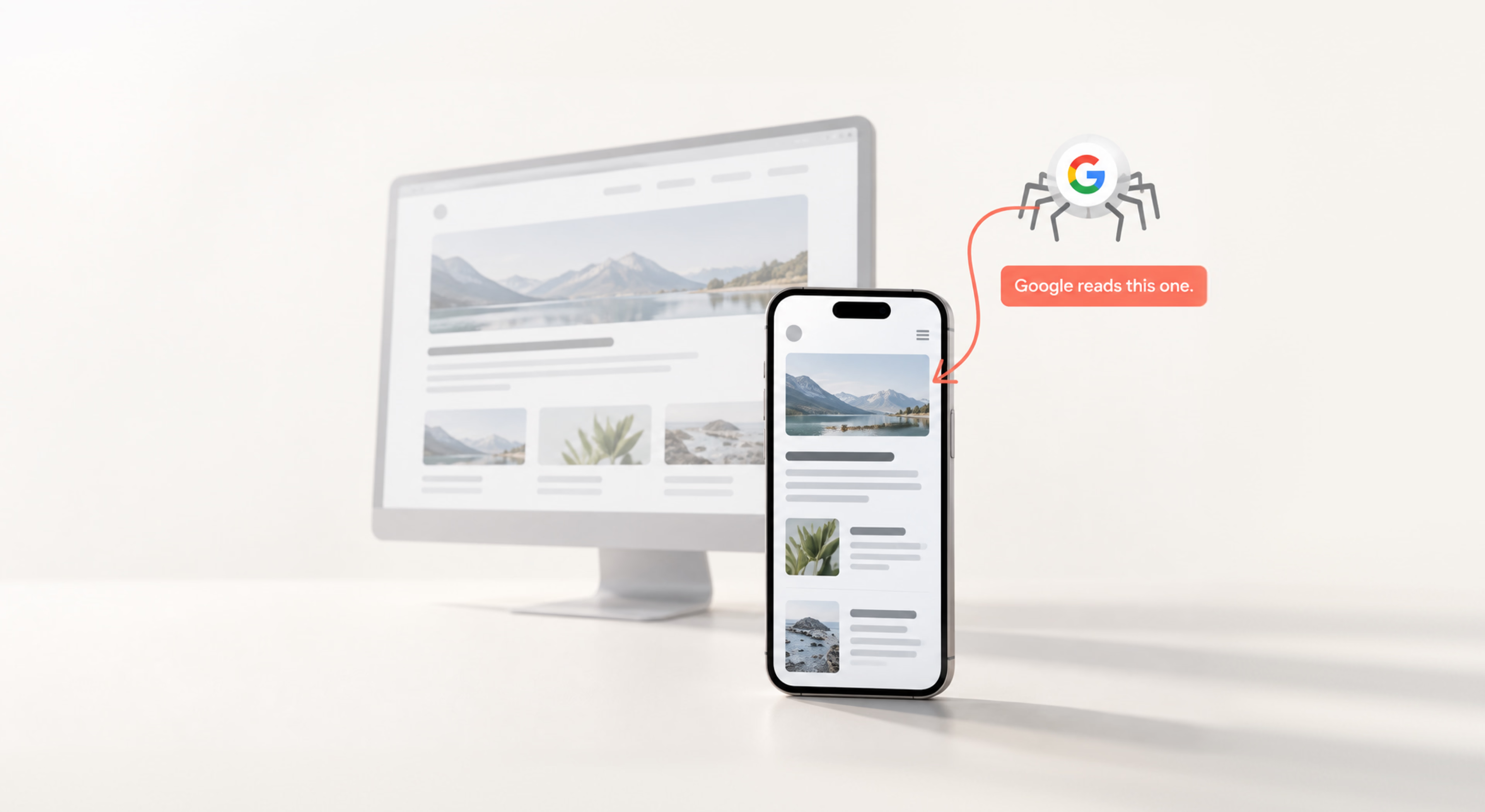
If you are still managing your digital footprint primarily from a spacious desktop monitor, you may be optimizing for a version of the web that is no longer Google’s primary reference point. A polished desktop experience, multi-column layouts, and elegant hover-state animations matter far less if the mobile version is incomplete, difficult to navigate, or poorly rendered. Google now uses the mobile version of a page as the primary basis for crawling and indexing.
In this guide, we’ll cover how mobile-first indexing works, the layout and rendering issues that can quietly affect search performance, and the practical checks you can run in Search Console before making changes.
What is mobile SEO?
Mobile SEO refers to the practice of optimizing a website to ensure it works well, displays properly, and loads quickly on smartphones and tablets. It involves refining your:
- technical setup;
- page layouts;
- asset loading speeds;
- structural text.
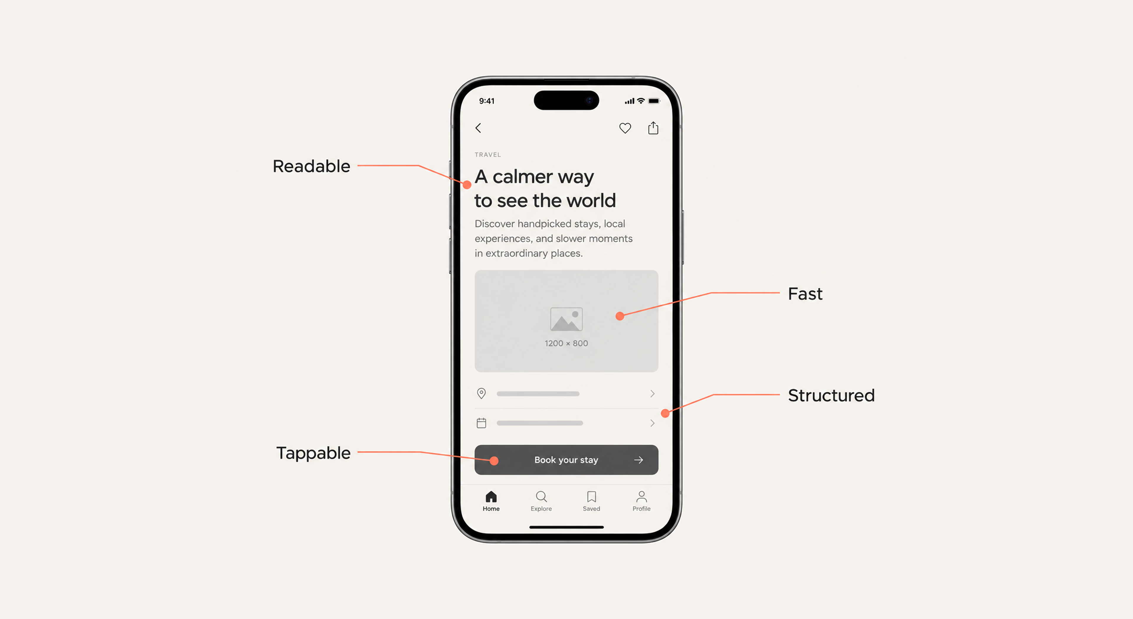
The goal of mobile SEO is to make your website easy to use on mobile devices while helping search engines crawl and understand your content. This includes making text readable without zooming, ensuring buttons and links are easy to tap, and providing a fast, intuitive browsing experience.
{{banner}}
Why is mobile SEO important?
Ignoring the handheld layout alienates the majority of your potential audience and signals to search algorithms that your platform is outdated. Let’s look more closely at the specific shifts forcing this change.
Mobile search dominance and user behavior
Mobile passed desktop in global web traffic back in 2016 and has held the majority since — StatCounter data puts smartphones alone at just over half of global website traffic, before counting tablets. People use phones to satisfy immediate needs: finding an answer, buying a product, or locating a business. What they expect is fast clarity. If a page requires zooming in, side-scrolling, or waiting several seconds for an image to load, they leave — and every one of those exits is a lost visit and, often, a lost sale.
Furthermore, mobile users are distinctly impatient. On a desktop, a user might leave a tab open for a few minutes while grabbing coffee. On a phone, they are actively hunting for a solution. If your text is hidden behind massive, unoptimized images or convoluted navigational menus, you lose that user in seconds.
Mobile-first indexing
Google began mobile-first crawling in 2016 and announced the transition complete in October 2023: in the announcement’s words, “a mobile web page now needed to be as complete as the corresponding desktop version.” Google no longer maintains two separate evaluation records for your site. Your smartphone presentation is the only presentation that establishes your baseline rankings. If you remove paragraphs, eliminate structured schema markup, or hide important navigation links on smaller screens to save space, Google acts as if that information doesn’t exist — even for desktop searches.
Revenue, conversions, and trust on mobile
A broken small-screen checkout flow or a layout that constantly shifts around while loading destroys buyer confidence. Visitors link visual stability and smooth interactions with corporate legitimacy. When your mobile SEO and UX work is done well, users complete forms easily, click buttons confidently, and go through checkouts without frustration.
Consider the physical reality of a thumb on a screen. If a checkout button sits too close to a cancellation link, or a form field forces the mobile keyboard to cover the input box, the transaction fails. That failure costs the sale directly — and the same instability shows up in your Core Web Vitals, which Google measures from real users and uses in ranking. If you’re not sure where mobile issues may be affecting your traffic or conversions, SEO сonsulting can help identify and address the underlying problems.
Mobile SEO impact on voice and AI search
Voice assistants and AI search engines don’t privilege “mobile-optimized” sites as such, but they reward the same underlying discipline. Most AI crawlers read the initial HTML and do not execute JavaScript, so content that only appears after client-side rendering is invisible to them, exactly as it can be to Googlebot Smartphone on a slow connection.
Voice search queries are inherently longer and more natural than typed phrases. Instead of searching “best running shoes,” a mobile user asks, “What are the best lightweight running shoes for flat feet with good arch support?” If your mobile search strategy includes natural language patterns, optimized FAQs, and swift rendering, you capture this specific, high-intent traffic.
What is Google’s mobile-first index?
The mobile-first index means Google uses the smartphone crawler version of a page to index and rank it. This section explains how the system works under the hood and why the change happened.
How mobile-first indexing works
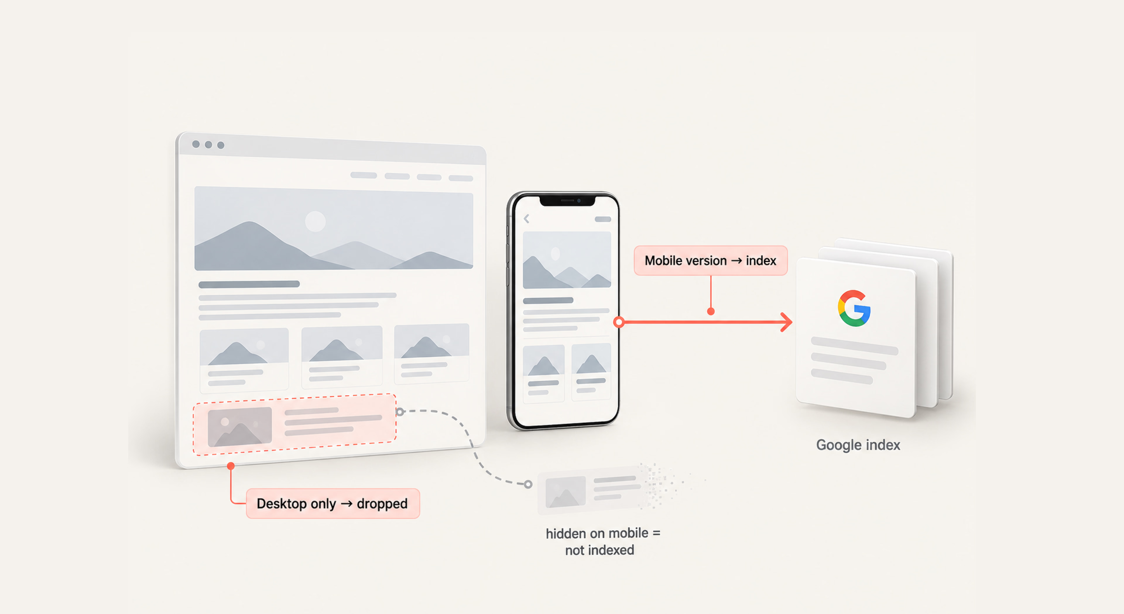
Google utilizes an automated software crawler called Googlebot Smartphone. When this bot visits your domain, it requests your pages using a simulated smartphone user-agent string. It reads your HTML, executes your JavaScript, downloads images, and assesses the visual layout on a narrow-screen canvas.
The data collected during this simulated mobile visit determines your position on search result pages across all devices, desktop computers and laptops included. If your mobile layout hides content that is visible on desktop, that hidden content is completely dropped from Google’s indexing pipeline.
{{banner-2}}
Why Google switched to mobile-first indexing
Historically, Google looked at desktop sites to determine relevance. However, this caused significant issues when a smartphone user clicked a link, only to find a stripped-down mobile site that lacked the text or tools promised in the desktop search results. To eliminate this frustrating mismatch, Google shifted its core architecture to match reality: since most people view the web on phones, websites must be built, crawled, and evaluated for that experience.
Mobile vs. desktop SEO
Traditional optimization often focused on rich sidebar components, large hero layouts, multi-layered hover menus, and deep nested links. Optimization for handheld devices requires a shift toward:
- vertical layouts;
- compressed file formats;
- asynchronous script loading;
- touch-focused interactions.
The core objective changes from “how much can we fit on this screen?” to “how fast and accurately can we deliver the exact answer the user needs?”
Mobile website configuration options
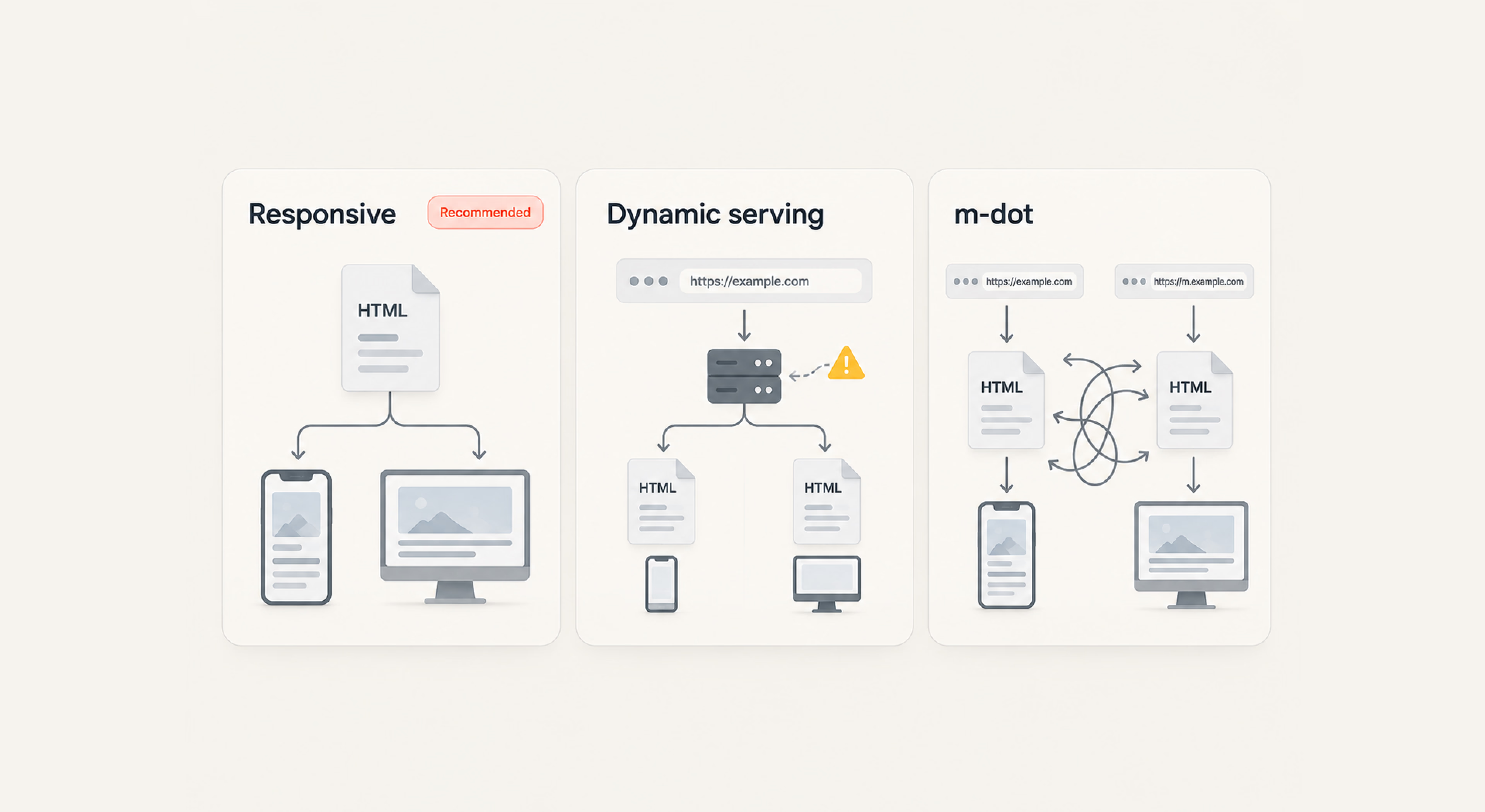
To support mobile users effectively, you need to choose how your site delivers content and assets across different screen sizes. Below, we’ll look at the three main configuration approaches, along with their advantages and limitations.
Responsive design
Google explicitly recommends responsive design, which uses a single set of HTML source code combined with CSS media queries. This lets the layout adjust automatically to any screen resolution, whether it is an older iPhone or an ultra-wide monitor.
- Pros: Highly cost-effective, easy to maintain, uses a single URL pattern, and eliminates duplicate content problems.
- Cons: Requires smart CSS planning and file discipline to prevent large assets from slowing down smaller devices on cellular networks.
Dynamic serving
With dynamic serving, your web server uses the same URL for all devices but detects the visitor’s user-agent string before delivering entirely custom HTML and CSS tailored to that device class.
- Pros: Allows you to build highly customized layouts for phone users without changing the desktop architecture.
- Cons: Highly prone to user-agent detection errors, complex to develop, and requires careful caching setup, since desktop versions could accidentally serve to mobile devices.
Separate mobile URLs
This approach is often called an “m-dot” setup. In essence, it sends desktop users to example.com and phone users to a completely separate subdomain like m.example.com.
- Pros: Offers full separation of codebases for isolated development paths.
- Cons: Discouraged today, requires complicated bidirectional canonical and alternate tags, doubles your maintenance workload, and can easily confuse search bots.
How to check mobile SEO performance
To evaluate your mobile SEO performance, you need to review real-world performance data, see how search crawlers access your pages, and check how they render on mobile. The following sections show how to do that.
Mobile traffic and ranking analysis
Open Google Search Console and navigate to the Performance report. Use the “Device” filter to compare your mobile traffic, impressions, click-through rates, and average positions directly against your desktop datasets.
If your rankings on phone searches lag significantly behind your desktop positions for identical search queries, you likely have hidden layouts, rendering errors, or asset performance blocks holding your mobile URLs back. Look for keyword drops that occur only on mobile devices; this usually highlights a gap where text is visible on desktop but stripped from the responsive mobile code.
Mobile usability and Core Web Vitals
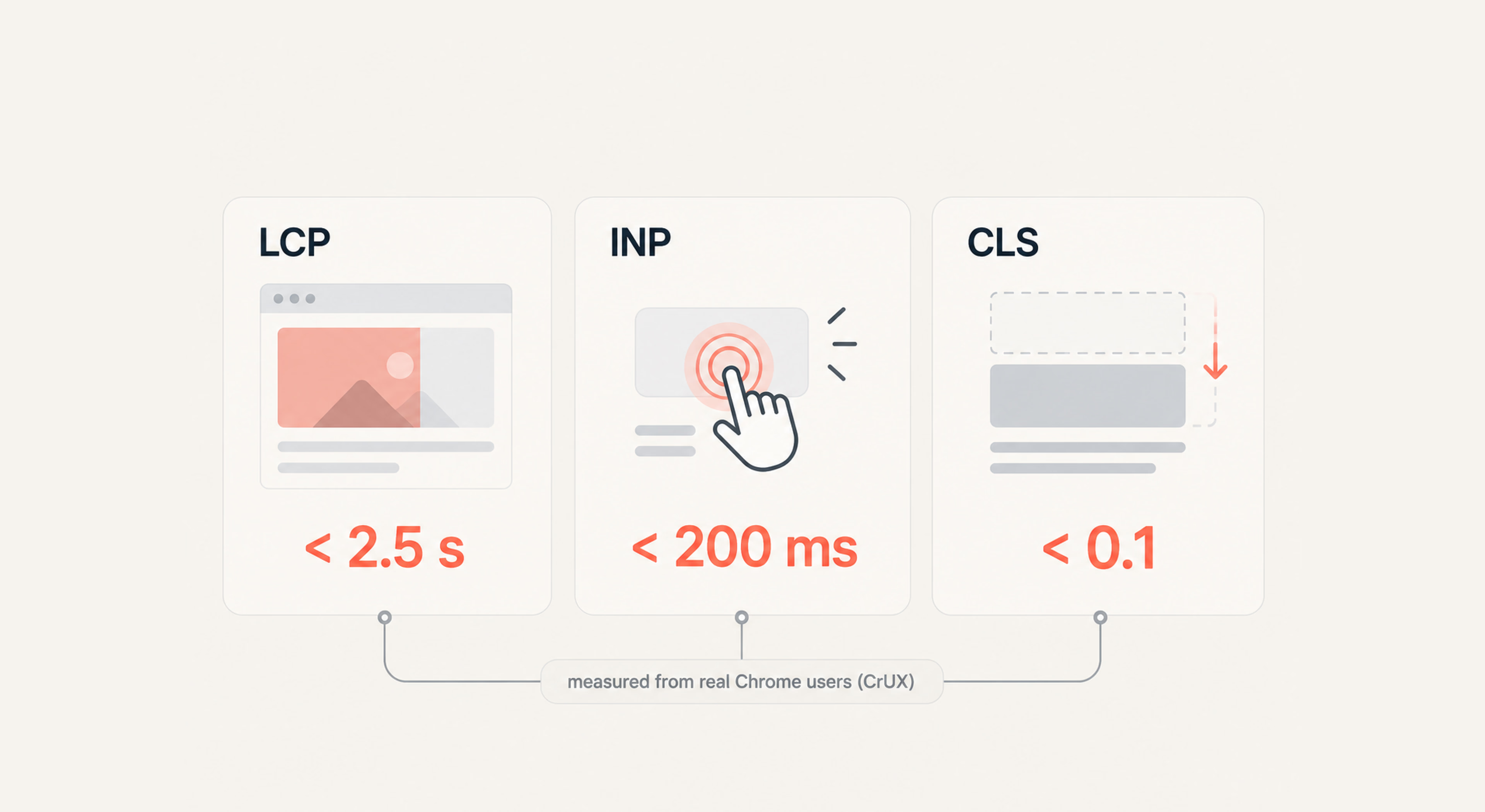
The Core Web Vitals report in Search Console provides a realistic view of how users experience your pages over cellular networks. This data is pulled directly from the Chrome User Experience Report (CrUX) and tracks three metrics:
- Largest Contentful Paint (LCP): Tracks when the primary visual element (a hero graphic or a large heading text block) is fully rendered on the screen. Aim for an LCP of under 2.5 seconds on a standard 4G mobile connection.
- Interaction to Next Paint (INP): Evaluates user interface responsiveness by measuring the delay between a user tapping a button or link and the browser executing the visual update. Keep your INP under 200 milliseconds to avoid user frustration.
- Cumulative Layout Shift (CLS): Measures structural stability by tracking if visual elements shift around unexpectedly while the page downloads code. Any shift score above 0.1 creates a layout where users accidentally tap the wrong buttons.
Core Web Vitals are only one part of the picture. Our SEO audit checklist can help you review them alongside other technical factors that may affect search performance.
Mobile crawlability and indexing
To verify how search engines view your underlying code, use the URL Inspection tool within Google Search Console. Enter a critical landing page URL and review the rendered screenshot and the extracted HTML code block. Pay particular attention to:
- Mobile navigation: Make sure Google can render and access your mobile menu and the pages linked from it.
- CSS and JavaScript: Check that essential CSS and JavaScript files are not blocked by your robots.txt rules, as this can prevent Google from properly rendering the page.
- Server performance: Review your server logs to see whether Googlebot Smartphone encounters 503 errors, slow response times, or other bottlenecks when crawling your site.
This becomes especially important at launch. In one of our gaming projects, we managed indexing from the pre-release stage, helping the new catalog get discovered and crawled early. The site later grew to 380,000 monthly users.
Competitive mobile SEO comparison
It’s important to analyze your primary competitors using third-party SEO tools, such as Ahrefs or Semrush, that let you compare rankings and visibility by device. Comparing your site with high-performing platforms shows where your layout needs improvement to capture changing traffic. The first step is to filter their ranking data specifically by device type to see if they are outperforming you on mobile-specific terms. Then, examine their layout choices:
- how they display complex data tables on a smartphone;
- if they use collapsible accordions to manage long text blocks;
- whether they serve streamlined interactive elements.
Mobile user experience optimization
Strong mobile SEO depends on clear layouts, easy navigation, and responsive interactions. If your design makes a user work hard to find an answer, they will likely return to the search results.
Page speed and performance
Every kilobyte of code matters when users browse on an unpredictable cellular data network. You should optimize your performance from the server down to the browser layout using these core technical steps:
- Modern image formats: Use WebP or AVIF where they provide a meaningful reduction in file size, while keeping JPEG or PNG when they better fit the asset. Google’s testing found lossy WebP images 25–34% smaller than comparable JPEGs at equivalent quality.
- Asynchronous loading: Load non-essential JavaScript bundles and third-party tracking scripts asynchronously (async or defer). This prevents tracking codes from blocking the main browser thread while visible elements render.
- Code minification: Strip out unnecessary comments, whitespace, and unused blocks from your core CSS and JS themes to keep code payloads light.
- Server response times: Use a Content Delivery Network (CDN) to cache static pages close to your users, significantly reducing Time to First Byte (TTFB).
Readability and layout for small screens
Next, make sure your text is easy to read without requiring users to pinch or zoom. Use a baseline font size of at least 16px for body text, and pair it with a line height of 1.5 to provide plenty of breathing room between lines.
Moreover, stick to high-contrast color choices so text remains clear even under direct, outdoor sunlight. Leave generous margins on both sides of the display canvas to keep paragraphs from running into the phone’s physical edges.
Interstitials and pop-ups compliance
Intrusive overlays that block the main body content the moment a visitor arrives are a direct search risk. Google’s interstitials documentation is explicit that intrusive overlays make content harder for search engines to understand and can lead to poor search performance.
If you have no choice but to use overlays for cookies, age gates, or legal notices, keep them to a minimum, include a prominent, easily clickable close button, and do not obscure the primary search-intent content.
Mobile content optimization
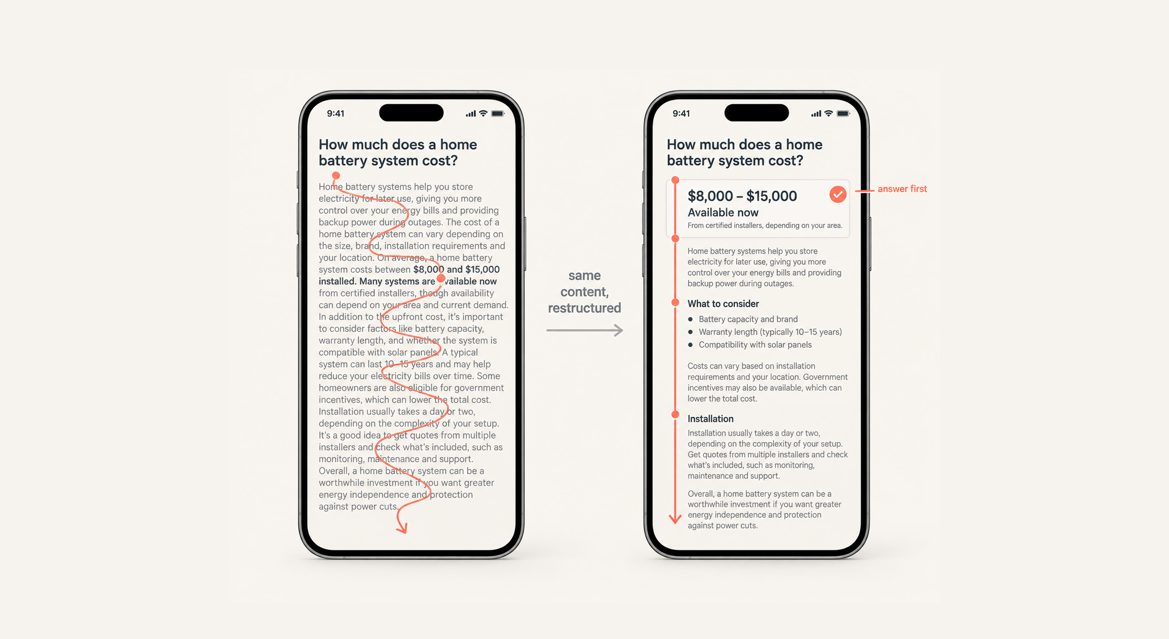
A common mistake is assuming that mobile users need less content. In practice, the goal is not to strip information away, but to make the most relevant information easier to find on a smaller screen.
“People don’t want less information on their phones; they simply want to find the right information faster.”
Use clear headings, scannable paragraphs, and bulleted lists to break up dense sections. Place important answers, pricing, availability, or next steps early in the layout so users can reach them quickly without digging through the page.
Mobile context can also affect what users need first. Someone searching on a phone may be looking for a direct answer, a location, a price, or an immediate action. Structuring content around those priorities can make the page more useful without reducing its depth. Keyword research services can help identify these search patterns and shape content around them.
Technical SEO for mobile-first indexing
Your visual layout matters, but the technical setup also needs to let search engines crawl, render, and understand your mobile pages without unnecessary performance barriers.
Tap targets, viewport, and visual stability
Begin by ensuring all interactive elements are easy to tap accurately on a touch display. This concerns buttons, input fields, and inline text hyperlinks. Maintain a minimum tap target size of 48x48 pixels, and provide ample spacing between adjacent links to prevent frustrating accidental misclicks. Always include the correct meta viewport tag within your HTML header code:
<meta name="viewport" content="width=device-width, initial-scale=1.0">Without this specific tag, mobile browsers will render your page at a generic desktop width and then scale it down. As a result, text will turn tiny, forcing users to zoom and scroll horizontally.
Full crawl access to mobile assets
Never use your robots.txt file to block search engines from accessing your core CSS, JavaScript, or image directories. If Googlebot Smartphone cannot crawl these vital assets, it cannot render or evaluate your page layout accurately. This can trigger mobile-friendly errors and pull down your organic search positions.
Structured data consistency on mobile
Another important part of technical SEO is ensuring your structured data (Article, Product, LocalBusiness, and Review markup) is consistent across desktop and mobile page variations. Because Google primarily uses the mobile version for indexing, structured data that is missing there may affect your eligibility for rich results.
Image and media optimization
For images and media, always specify explicit width and height attributes directly on your image tags to prevent sudden layout shifts as your page loads. Use responsive image attributes like srcset to serve appropriately scaled images for different screens. This ensures phone users don’t waste data downloading images made for large desktop screens.
<img src="photo-480.jpg" srcset="photo-480.jpg 480w, photo-800.jpg 800w" sizes="(max-width: 600px) 480px, 800px" alt="Optimized responsive image asset" width="800" height="600">JavaScript rendering and indexing
If your platform relies heavily on client-side JavaScript frameworks like React, Angular, or Vue, test your pages carefully to see if Google can crawl your text content. If you need to know whether all text pulled in via API calls renders correctly within the initial HTML snapshot seen by search engines, use the URL Inspection tool to confirm that. Server-Side Rendering (SSR) or Hydration is highly recommended to ensure indexing, and — as covered in the voice and AI section — it also makes your content readable to AI crawlers that never execute JavaScript.
“Mobile SEO succeeds when performance, usability, and accessibility work together.”
Common mobile SEO mistakes
Some mobile SEO problems start with seemingly minor design or development choices. On a smaller screen, those choices can have a much bigger impact than expected. Here are the ones worth watching most closely.
Missing or reduced mobile content
A common mobile SEO misstep is removing important content to shorten pages. Teams may hide product descriptions, reviews, headings, or accordion content on smaller screens, but this can also reduce the content search engines can access and index.
Practical advice: Your mobile page should still contain the key information you want to rank for, including relevant headings, descriptions, and supporting content. If space is limited, use CSS, accordions, or tabs to organize the content. This keeps the mobile layout clean without sacrificing useful content for search engines.
Desktop-first optimization decisions
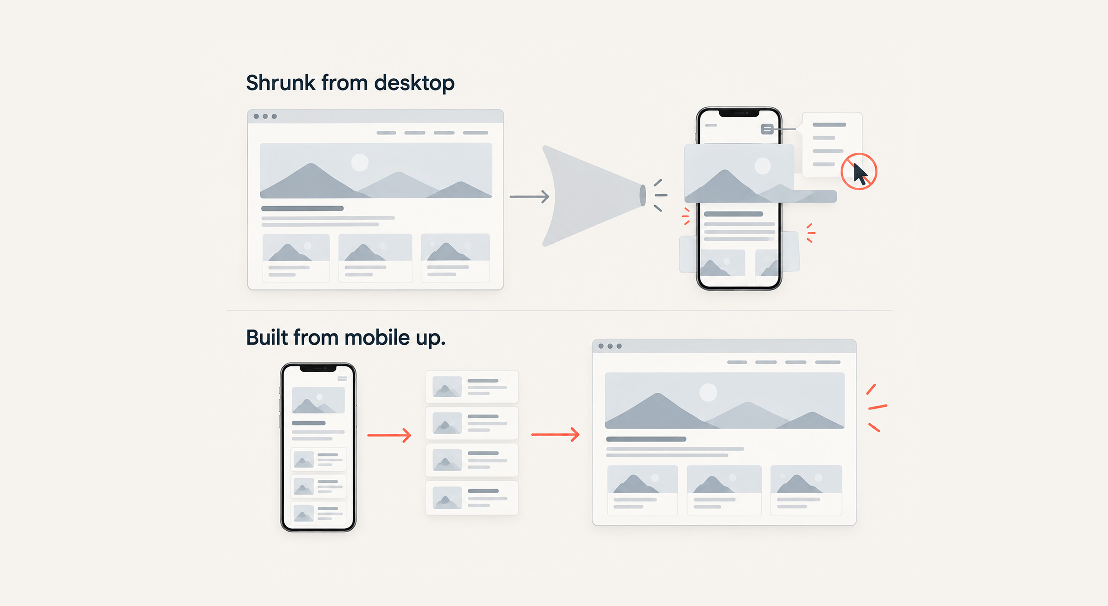
Designing a website for a large desktop screen and adapting it to mobile later can create hard-to-fix problems. Dense layouts, large images, and complex navigation often don’t translate well to a smaller screen.
The same applies to hover-based navigation. Desktop sites can use :hover states to show menus, tooltips, or additional links because they rely on cursor movement. That’s not the case on phones, however, since they rely on taps. If important navigation only appears on hover, mobile users may not be able to access it.
Practical advice: Design for mobile constraints first. Build a layout that works well on a small screen, loads quickly, and uses simple touch-based navigation. Then expand that layout for larger screens.
UX shortcuts that harm rankings
Shortcuts that speed up development can create mobile SEO problems later. One common example is using fixed-width CSS such as width: 1200px; instead of flexible values such as width: 100%; or max-width. On a narrow screen, a fixed-width container can extend beyond the viewport, forcing horizontal scrolling and making the page harder to use.
Other problems include making text too small or placing touch targets too close together. As a result, mobile pages become harder to read and interact with, which can lead to usability issues.
Another mistake is putting important text inside images instead of using actual HTML text. Search engines can have more difficulty understanding text embedded in graphics, and users may also lose access to that content when images fail to load.
Practical advice: Keep important headings, descriptions, and other content as HTML text so users and search engines can access it.
Make mobile your SEO baseline
The deeper point behind mobile SEO is that the mobile version is no longer a secondary experience. It has to carry the same content, technical signals, and usability standards as the rest of the site.
So when you review a page, start with the mobile version. Check what Google can access, what users can reach without friction, and what gets lost once the layout shrinks. That perspective makes it much easier to spot the issues that actually deserve attention before they start affecting visibility or conversions.
{{banner-3}}
FAQ
Does mobile-first indexing apply to every website?
Yes, Google now applies mobile-first indexing universally across the web. Whether your target audience uses desktop systems or mobile devices, Google judges and ranks your entire domain based on how well its content performs for the smartphone crawler.
Can weak mobile UX reduce desktop rankings?
Yes. Google primarily evaluates and indexes the mobile version of your site, so mobile issues such as slow load times, poor usability, or missing content can affect your search performance across devices, including desktop.
How does mobile-first indexing affect crawl budget?
Because Google crawls primarily with Googlebot Smartphone, heavy, unoptimized code or messy internal redirect paths on your mobile URLs can waste your crawl budget and delay how quickly new pages are indexed.
Is mobile-first SEO different for enterprise websites?
The core SEO principles are the same, but applying them across large sites is more complex. Small issues like broken rendering, missing structured data, or oversized images can affect thousands of pages at once. Regular monitoring and automated checks help catch these problems early.
Does mobile-first indexing impact international SEO?
Yes. Mobile-first indexing makes it important to keep your mobile and desktop versions consistent. Make sure both versions use the same hreflang tags, internal links, and localized content. Missing or inconsistent elements on mobile can affect how Google understands and ranks your international pages.