




When someone is about to hand over sensitive documents, every unanswered question can become a reason to leave before the form even loads. In legal services, that hesitation is expensive.



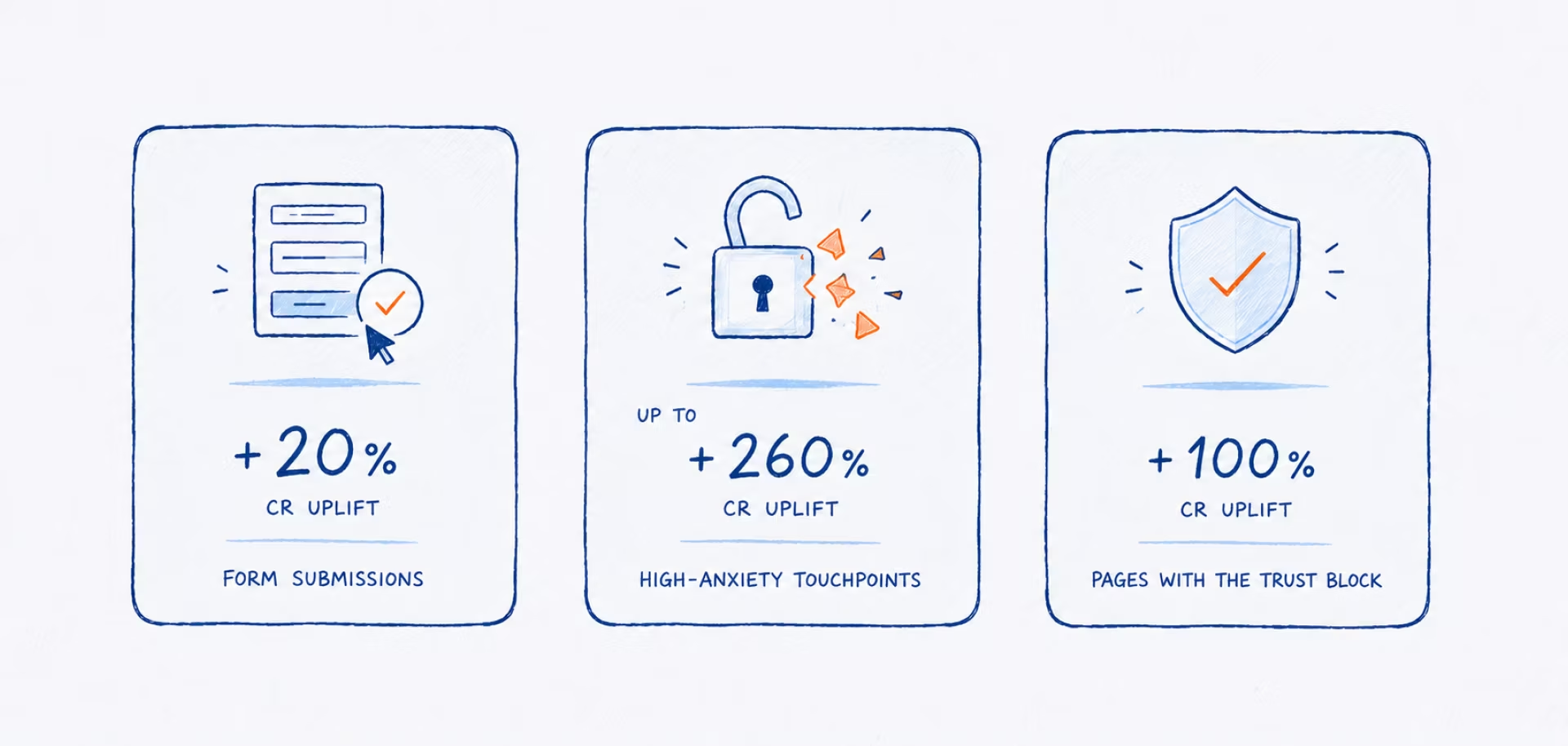
Our client was seeing exactly this pattern across its highest-intent apostille and legalization pages. This case shows how a series of targeted UX and CRO improvements reduced those psychological barriers and turned inconsistent service pages into more reliable sources of leads.
{{banner}}
The challenge
The core problem for our client, a U.S.-based legal services provider, was low conversion on its key apostille and legalization pages. It was hovering around 4–6%, a critical figure given that most of the service’s traffic came from paid channels. Users also took time to make a decision, so any uncertainty — “What happens after the click?”, “How many steps are ahead?”, or “Can I trust this service?” — increased drop-off before they even started the form.
In practice, three barriers stood out:
- Users didn’t understand what would happen after they clicked.
- The legal process looked even more complex than it actually is.
- A meaningful share of traffic simply stalled just before starting the form.
The main goal was to increase both the conversion rate on the service pages and the quality of incoming leads by conducting controlled A/B testing. An important requirement was to achieve this goal without a full website redesign.
In complex legal services, users rarely make decisions right away. Conversion grows not from brighter design, but from reducing anxiety and uncertainty.
Our approach: diagnose before you test
Before developing any hypotheses, we conducted a comprehensive quantitative and qualitative analysis. This included reviewing six months of Google Analytics data to identify key trends and behavioral patterns across the user journey.
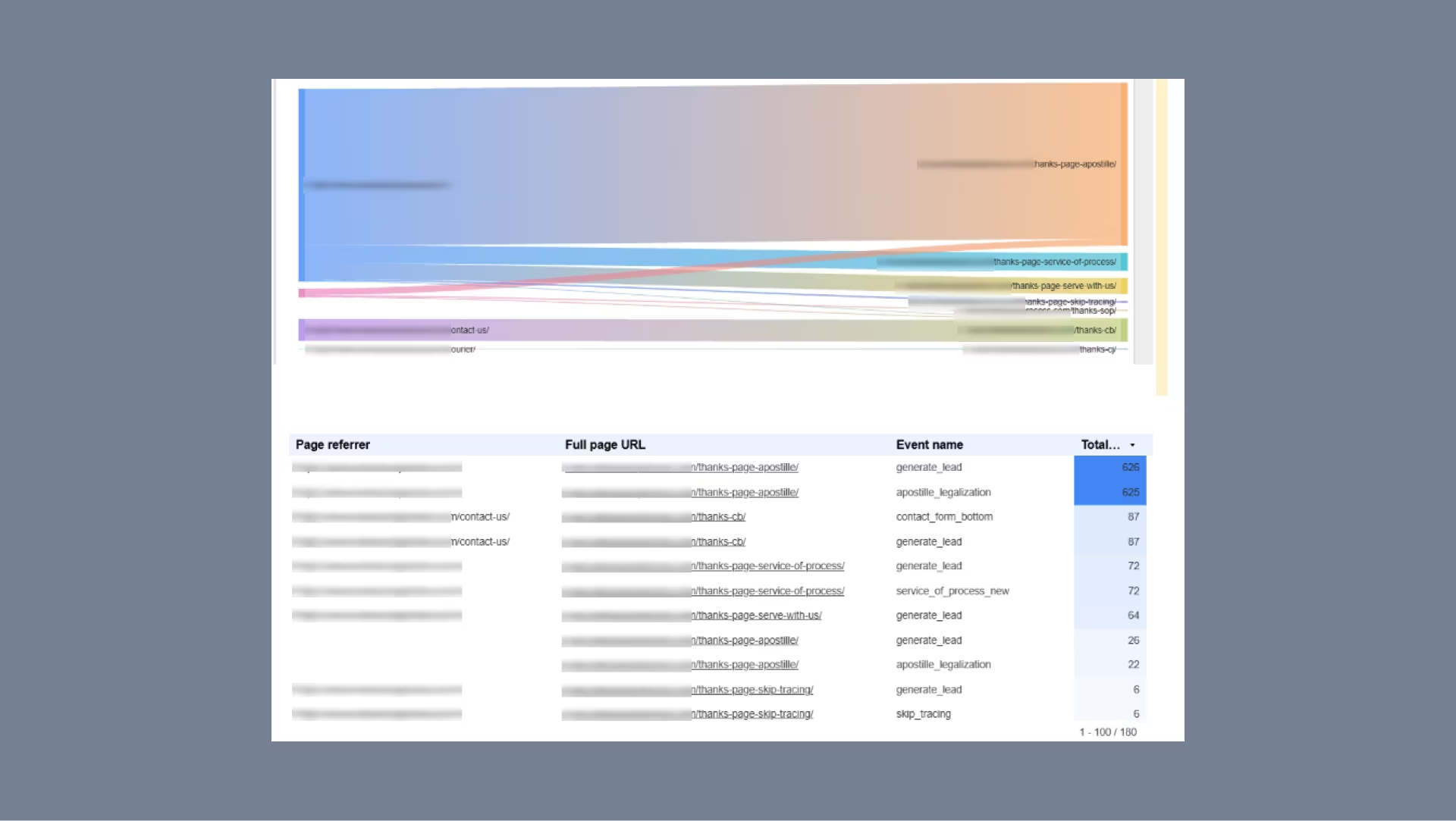
The upper visualization works as a Sankey chart, where the width of each line represents the volume of user transitions. It allowed us to quickly see which paths led to conversion pages such as /thanks-page-apostille/, /thanks-page-service-of-process/, and /thanks-cb/, as well as which pages generated the highest volume of conversion-related traffic.
The table below provided the details behind those flows. While the Sankey chart showed the overall direction of user movement, it did not always reveal which specific event triggered the conversion. The table connected each referrer page and final URL with the corresponding event name and total number of events.
This distinction was important because the same thank-you page could be associated with several conversion events, including generate_lead, contact_form_bottom, and skip_tracing. In other words, the chart showed the main user flow, while the table explained which conversion event caused that flow to be recorded.
How we built the view
We created the view in Looker Studio using a Sankey chart from Community Visualizations. The setup included:
- Page referrer as the first dimension;
- Full page URL as the second dimension;
- Event count as the metric.
To keep the analysis focused, we filtered the data to include only relevant thank-you and conversion-related pages. This ensured that the visualization reflected conversion routes rather than traffic across the entire website.
Connecting the “what” to the “why”
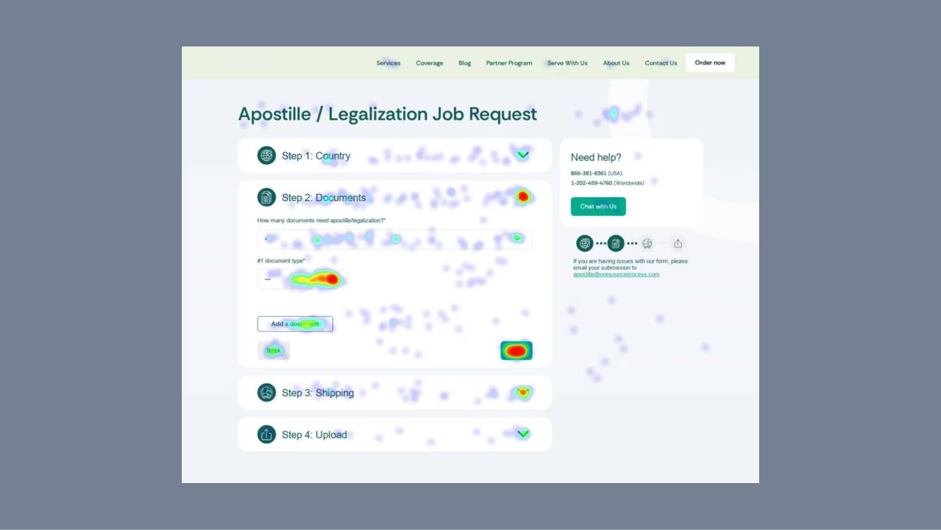
To understand what was driving the drop-off, we complemented the analytics data with insights from Microsoft Clarity. Scroll maps, heatmaps, and session recordings helped us identify where users hesitated, stopped engaging, or abandoned the journey.
The hypotheses: remove anxiety, don’t add decoration
The research showed that the pages left too much uncertainty unresolved. Each UX hypothesis was therefore designed to reduce hesitation, make the process feel more manageable, and give users greater confidence in taking the first step.
UX hypotheses:
- Autofocus on the first form field. Placing the cursor directly in the first field could reduce the friction of getting started and shorten the time to the first interaction.
- Soft decision triggers. Triggers such as “Start here” and “Make a decision now” could give users a clearer next action and reduce the mental effort required to begin.
- A visual, step-by-step block. Explaining what happens next could address one of the main sources of anxiety: not knowing what to expect. Greater transparency could make the service feel more predictable and trustworthy.
- A progress indicator. Showing “Step 1 of X” could frame the form as a finite, controlled process. Users may be more willing to begin a longer flow when they can see how many steps it contains.
- Trust signals and a clearer value explanation. Trust elements could be placed at the points where users are already considering the service, reinforcing credibility and clarifying why it is worth continuing.
Our main takeaway is that in high-consideration legal services, the interface should answer users’ unspoken questions before those questions become reasons to leave.
{{banner-2}}
Toolkit & team behind the test
To validate the hypotheses, we combined a lightweight testing setup with quantitative and qualitative analytics:
- Crazy Egg (A/B testing). We used it to launch and compare page variants without heavy engineering. It allowed us to split traffic, test hypotheses quickly, and see which version guided users more effectively toward the target action.
- Google Analytics 4. It was our primary source of traffic, event, and conversion data, helping us understand how users interacted with each page, which channels drove traffic, and how behavior changed after a test went live.
- Looker Studio. We relied on it to visualize results and create clear reports for the team and stakeholders. It brought key metrics, user flows, conversion events, and overall test performance into one place.
- Microsoft Clarity. Session recordings, heatmaps, scroll maps, and attention data supported the qualitative analysis. They helped us see how users moved through a page, where they stopped, what they ignored, and where friction was likely to occur.
The analytical side of the experiment was led by a CRO / Web Analyst:
- developing the hypotheses;
- configuring the tests;
- validating the tracking setup;
- analyzing the results;
- preparing the final conclusions.
The main focus was whether the new variant improved the user flow, progression rate, and quality of the first step toward conversion.
At the early stage, the team could validate the hypotheses through A/B testing and analytics platforms without fully involving developers. This kept iteration fast, reduced technical overhead, and avoided spending development time on changes that had not yet demonstrated their value.
Conversion gains without a redesign
A series of targeted CRO changes turned pages with low and unstable conversion rates of 4–6% into more reliable lead-generation channels.
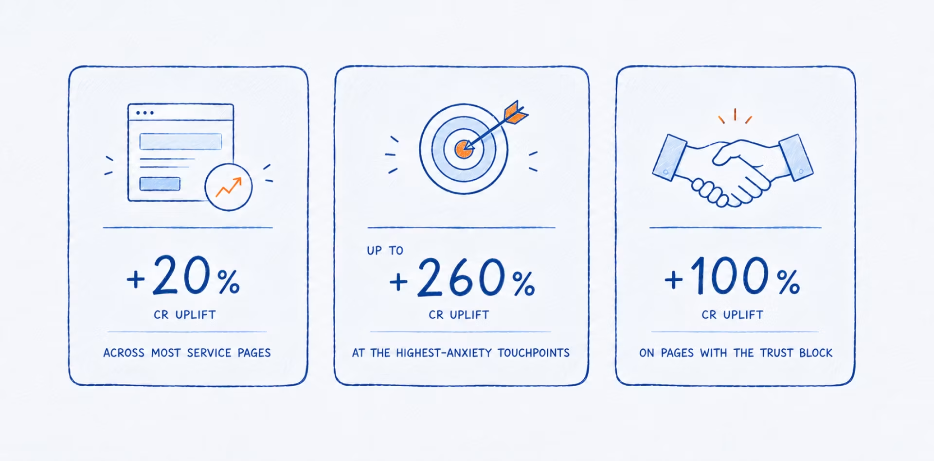
By addressing three key UX barriers — hesitation to begin, uncertainty about the process, and lack of trust — we increased conversion by 20% across most pages. On pages with the strongest psychological barriers, conversion rose by 2x to 3.6x.
The result was more than a better-performing interface. Without increasing traffic or committing to a full redesign, the client generated more leads from the audience already reaching the site. And because our work together is ongoing, these results represent progress to date rather than the final chapter. There is more to come.