



Learn how to audit every key SaaS page to uncover conversion leaks, improve trial signups, optimize pricing, forms, navigation, and landing pages with actionable CRO insights.



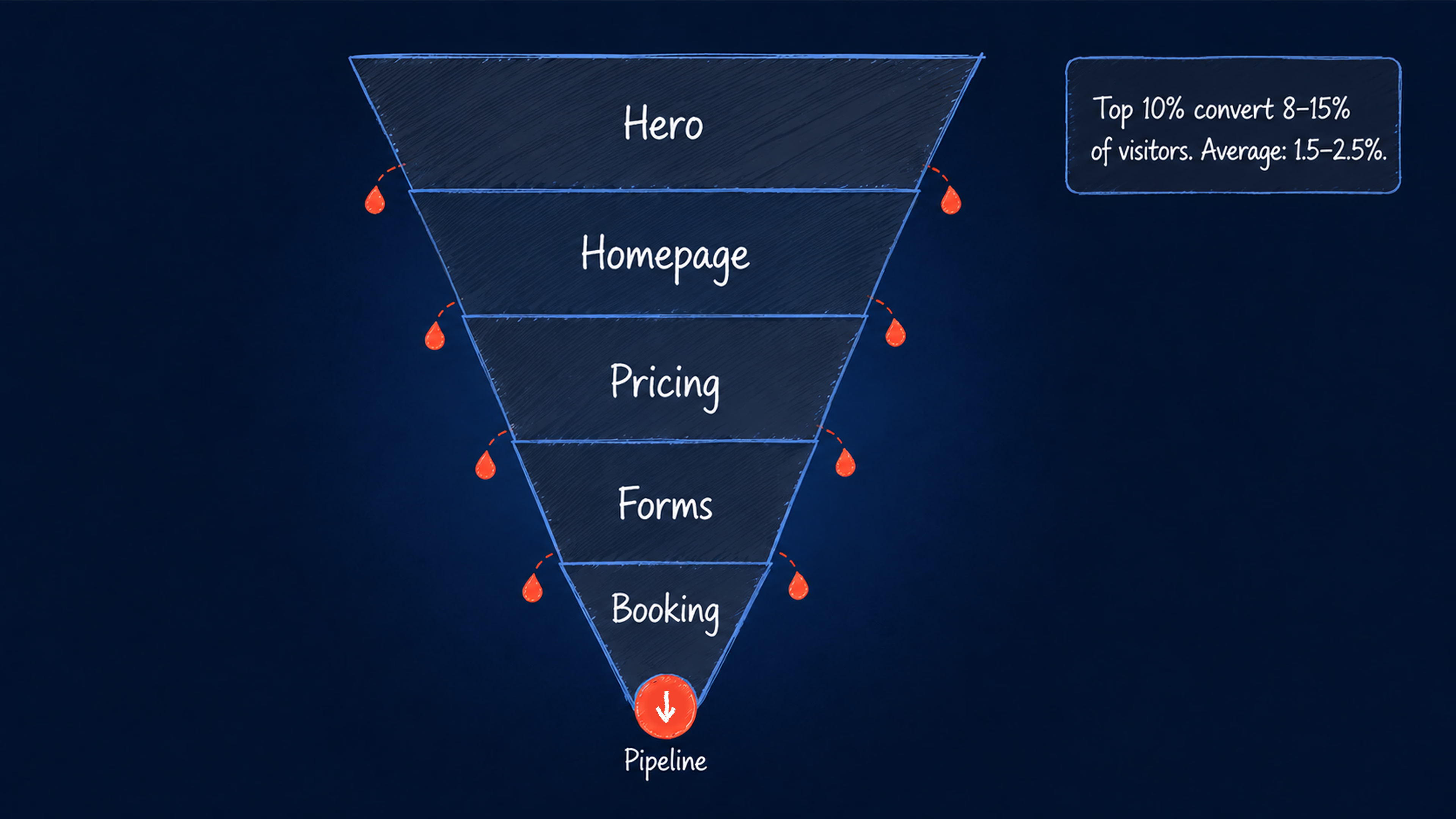
If you’ve invested in paid campaigns and sharpened your messaging, but trial signups aren’t moving, the problem isn’t always your product. Your website may be leaking conversions across the journey — and many of those leaks stay invisible until you know where to look.
In B2B SaaS, the average visitor-to-lead conversion rate sits between 1.5% and 2.5%, while the top 10% of performers reach 8–15%. That gap rarely comes from traffic alone. It usually hides in the small moments where visitors pause, doubt, get distracted, or lose the reason to keep moving. In this article, we’ll break down the key elements of a SaaS website and show what to fix to stop losing conversions.
{{banner}}
Hero section — value proposition
If you’ve already researched this topic, you’ve surely seen claims that you have 7 seconds to attract a user. However, according to recent studies, visitors’ impressions and decisions about whether to stay or leave emerge within the first few seconds of exposure and typically stabilize within about 10 seconds. In SaaS, that window is your chance to communicate what the product does, who it’s for, and why it matters. In this context, the hero must sell the conviction that the visitor is in the right place.
Hero’s role from a UX perspective
As indicated by Hick’s law, the hero works well when it includes one clear message and one primary action. Anything more, like a second CTA or a feature list, and making decisions gets slower. Under Fitts’s law, your primary CTA must be large enough to click without hesitation, positioned where the eye lands.
Lastly, the hero section must follow a certain visual hierarchy to be effective in UX. It goes as: headline → supporting visual → subheadline → CTA. Since users scan before they actually read, this is how human perception processes information. Our guide on how psychology and UX influence user decisions covers each of these principles in depth.
What a high-converting SaaS hero looks like
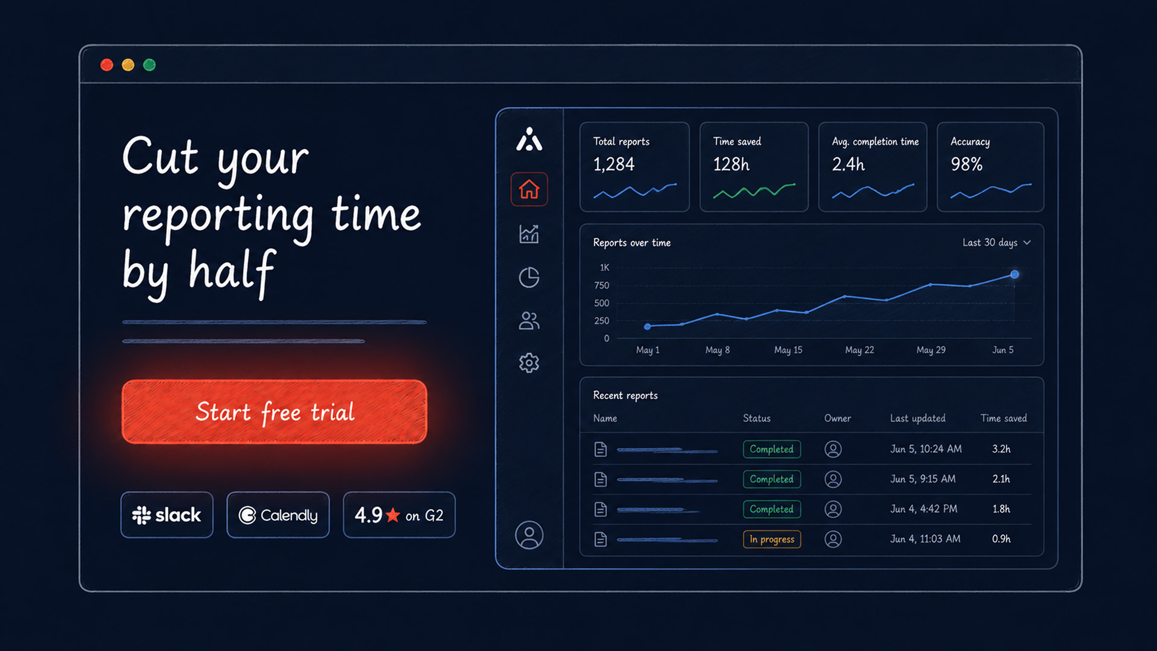
A strong SaaS hero starts with an outcome-led headline. “Cut your reporting time by half” is more persuasive than “The all-in-one analytics platform for modern teams” because it tells visitors what they gain, not just what the company has built.
The rest of the hero should support that promise. A useful message framework moves from market context to a specific problem, clarifies who the product is for, explains why existing solutions fall short, introduces your solution, and backs it up with proof. Your headline, subheadline, and visual do not need to spell out every point in full, but together they should make the value clear enough for visitors to keep reading.
Visuals play a major role here. Many high-performing SaaS websites show the actual product UI in use instead of relying on abstract graphics or decorative dashboards. A real screenshot answers the visitor’s silent question — “what does this actually look like?” — before they need to ask.
The CTA structure should be just as focused. Use one primary CTA, such as “Start free trial” for a self-serve product or “Book a demo” for a sales-led motion, and add one optional secondary text link, such as “See how it works.” Two equally weighted CTAs can split attention and weaken both actions.
Expert tip: Test a text-based secondary CTA against a second button. Text links for secondary actions often feel lower-commitment to visitors and stop competing visually with the primary CTA.
Key metrics & KPIs
Tracking setup
| What to track | How |
|---|---|
| Hero viewed | hero_view — hero_id, visible_percent, duration_visible_ms |
| CTA clicked | hero_click — cta_text, cta_position, cta_type (trial/demo) |
| Time to first click | avg. time between page_view → hero_click |
| Scroll past hero | Scroll trigger at 25% |
| Qualitative behavior | Hotjar or Clarity — heatmaps + session recordings |
Key metrics
| Metric | Formula | Benchmark / Signal |
|---|---|---|
| Hero CTR | hero_clicks / hero_views | 2–5% organic, 5–10% paid |
| Hero → trial start | trial_starts / hero_clicks | Track by CTA variant |
| Hero → demo booked | demo_bookings / hero_clicks | Track by CTA variant |
| Time to interaction | avg. page_view → hero_click | Above 8s = headline isn't landing |
Homepage — signup/trial funnel
The SaaS homepage has to do something a traditional business website rarely needs to do: turn a skeptical, comparison-shopping buyer into a trial signup or demo request. Every section should be evaluated by its role in the path to conversion, not by brand impression alone.
Homepage’s role from a UX perspective
Through the lens of progressive disclosure, the homepage should lead with the outcome before explaining the mechanics. Show users what they gain first. Features, integrations, and technical details start to matter once visitors feel they are in the right place. The goal is to create a quick “aha moment,” when the product’s value clicks clearly enough to keep them moving.
The aesthetic-usability effect also matters here. Visual polish shapes perception before users read every detail. For B2B SaaS buyers comparing multiple options at once, a clean and cohesive design can signal a high-quality product and make the experience feel more trustworthy.
The serial position effect makes page structure especially important. Users are more likely to remember what they see first and last, which puts extra weight on the above-the-fold message and the final CTA before the footer. These moments often carry more influence than the sections in between.
What a high-performing SaaS homepage looks like
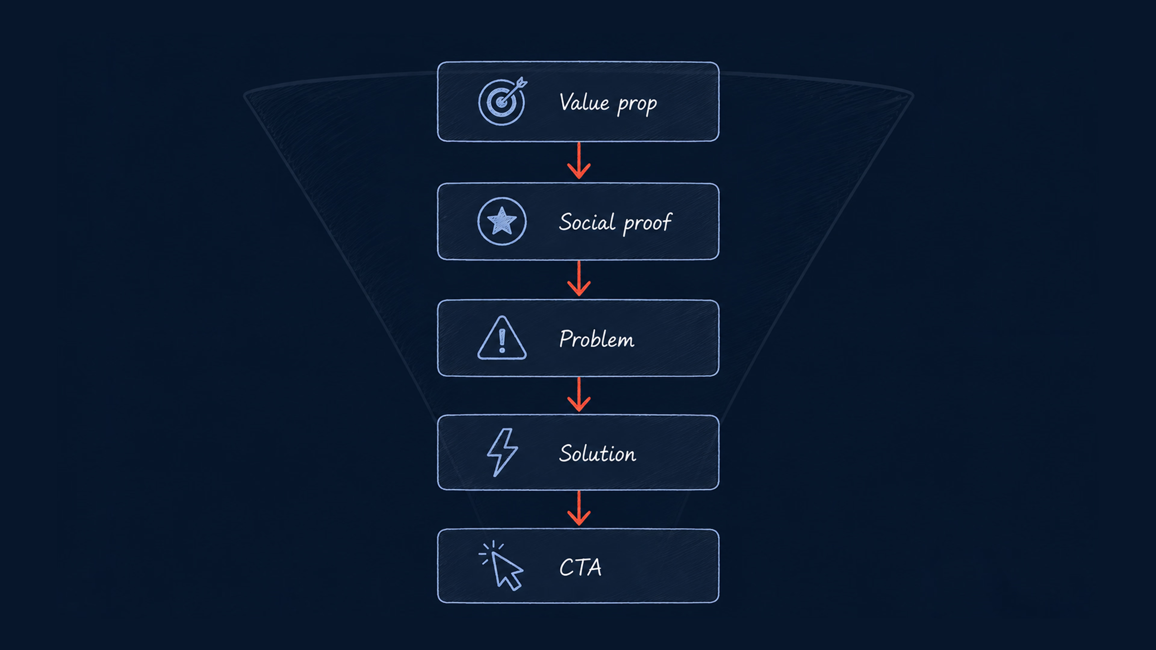
- Hero — outcome-led value prop, primary CTA, real product visual.
- Social proof strip — client logos immediately below the hero, before any feature explanation. This is one of the most underused conversion levers on SaaS homepages.
- Problem statement — name the pain in the buyer’s language. Keep it short, direct, and free of jargon.
- Solution demonstration — add product screenshots or a short walkthrough video showing how the product works.
- Feature/benefit section — 3–4 outcomes, not capabilities: “Automated reporting → your team stops building decks and starts making decisions.”
- Case study or testimonial — one named client and one specific result are more valuable than five anonymous ratings.
- Secondary CTA — repeat the primary offer or introduce a lower-friction path (“Watch a 2-minute demo”).
- Trust signals — SOC 2, GDPR, G2/Capterra ratings, integration logos.
Expert tip: Progressive onboarding, where features are introduced as users need them, can support stronger activation than “big bang” training flows. If your homepage drives visitors to a trial, the post-signup experience matters as much as the homepage itself.
Key metrics & KPIs
Tracking setup
What to trackHowHomepage loadedhomepage_view — variant, sourceCTA clickedhomepage_cta_click — cta_id, cta_text, position, cta_typeSocial proof engagedsocial_proof_click — element_typeVideo playedvideo_play — play_duration_pctScroll depth25 / 50 / 75 / 100%
Key metrics
MetricBenchmarkHomepage → trial/demo rate2–5% average, 7–10%+ top performersMQL-to-SQL rate32–40% healthy rangeSQL-to-close rate20–25%
Primary funnel: homepage_view → pricing_view / feature_page_view → trial_start / demo_booked
Upon Halo Lab’s redesign and development, we observed a notable 35% increase in traffic, with the bounce rate significantly decreasing by 20%.
— Justin Lopez, DGM at WeSpire
Navigation — docs, pricing, features
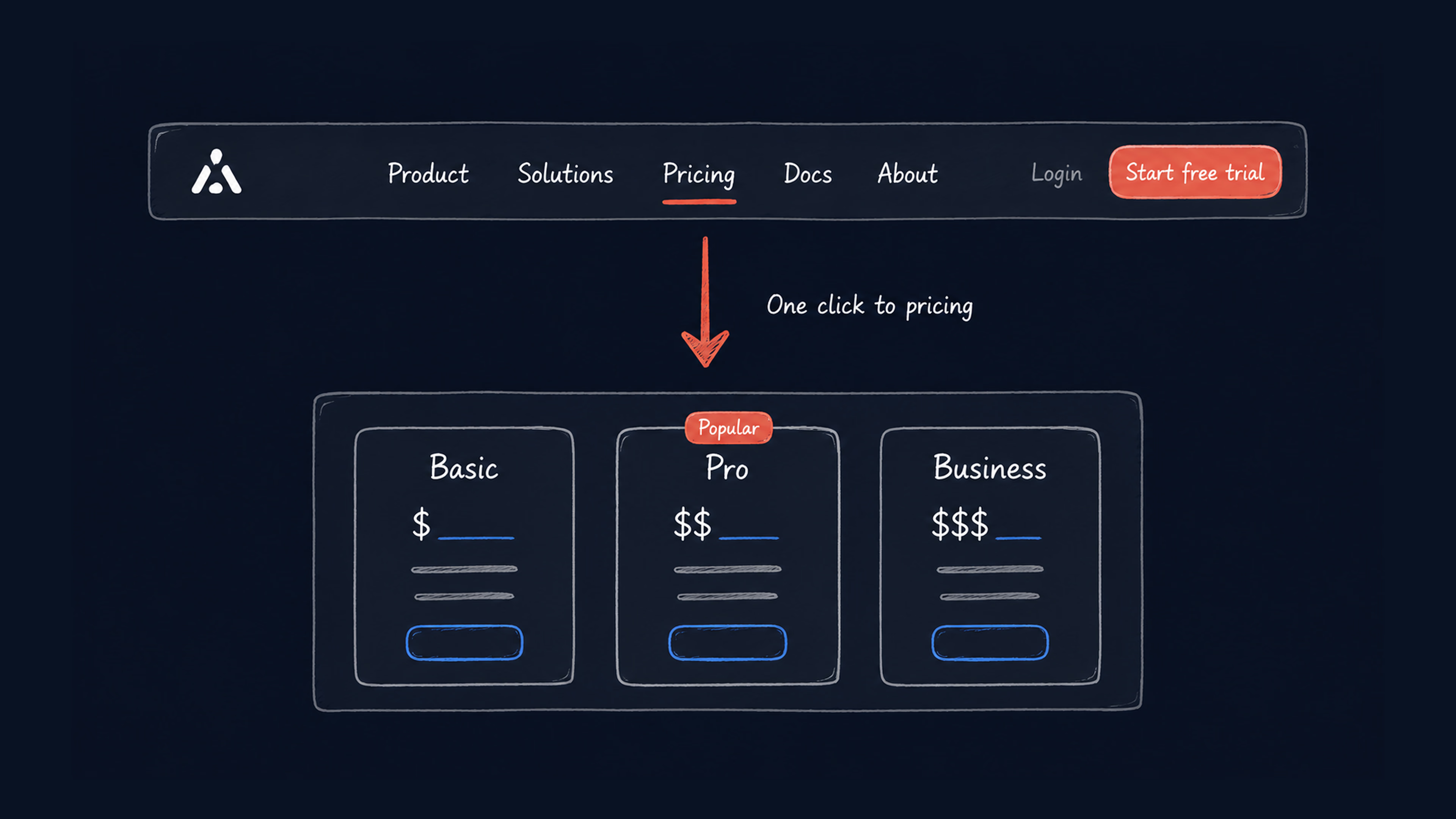
For a SaaS or services website, navigation shapes how buyers evaluate the offer. A buyer moving from awareness to consideration needs to find three things without friction: what the product does, what it costs, and whether it feels trustworthy. Your navigation either makes that user path obvious or forces the buyer to work for it.
Navigation’s role from a UX perspective
Viewed through Jakob’s law, SaaS buyers already have a mental model built from dozens of other tools they’ve evaluated. The expected pattern is Product/Features → Solutions → Pricing → Resources → Login + primary CTA. Deviating from that pattern without a strong reason adds friction.
Miller’s law explains why the header should stay selective. When the navigation carries too many competing items, users spend more effort deciding where to click. For most SaaS websites, five to seven primary menu items is usually enough to support exploration without creating unnecessary choice.
Information scent is what makes each label worth the click. “Platform” tells a buyer very little, while “For sales teams” or “Pipeline automation” immediately signals whether the page is relevant.
What effective SaaS navigation looks like
- Primary nav: Product (or Features), Solutions, Pricing, Resources (or Docs), About.
- Header CTAs: Login (top right, always visible) + one primary CTA button in a distinct color, persistent on scroll. Two primary CTAs in the header reduce clicks on both.
- Pricing visibility: The most common navigation failure in SaaS is burying or removing the Pricing page. Buyers who cannot find pricing information are more likely to leave, delay their decision, or switch to a competitor that makes evaluation easier.
- Docs and resources: Link your knowledge base from the top nav. A buyer evaluating your product checks for good documentation — it’s a trust signal before it’s a support tool.
- Campaign landing pages: Remove the navigation on focused pages driven by paid traffic or email campaigns. With fewer exits, the page can keep attention on the intended CTA.
Expert tip: Highlight your primary CTA button with a contrasting color — not just bold text. It must be visually distinguishable from all nav items on every page.
Key metrics & KPIs
Tracking setup
What to trackHowNav item clickednav_click — label, level, positionPricing page visitedpricing_page_view — source_pageDocs accesseddocs_click — section, source_pageHeader CTA clickedheader_cta_click — cta_type (trial/demo/login)Login clickedlogin_click — source_page, distinguishes returning users from new visitors
Key metrics
MetricSignalPricing page visit rate% of homepage visitors clicking Pricing — low = pricing link unclearTime to first nav clickHow long before the visitor starts exploringHeader CTA click rate% of page visitors clicking the primary header CTA
Nav funnel: landing → nav_click(pricing) → pricing_view → trial_start / demo_booked
Pricing page
The pricing page is often one of the most-visited pages on a SaaS website. It is also where buyers decide whether the product feels realistic for their budget, team size, and buying process. They arrive with intent, compare you to alternatives, and look for reasons to continue or step away. The pricing page’s job is to reduce hesitation and make the next step feel clear.
Pricing page’s role from a UX perspective
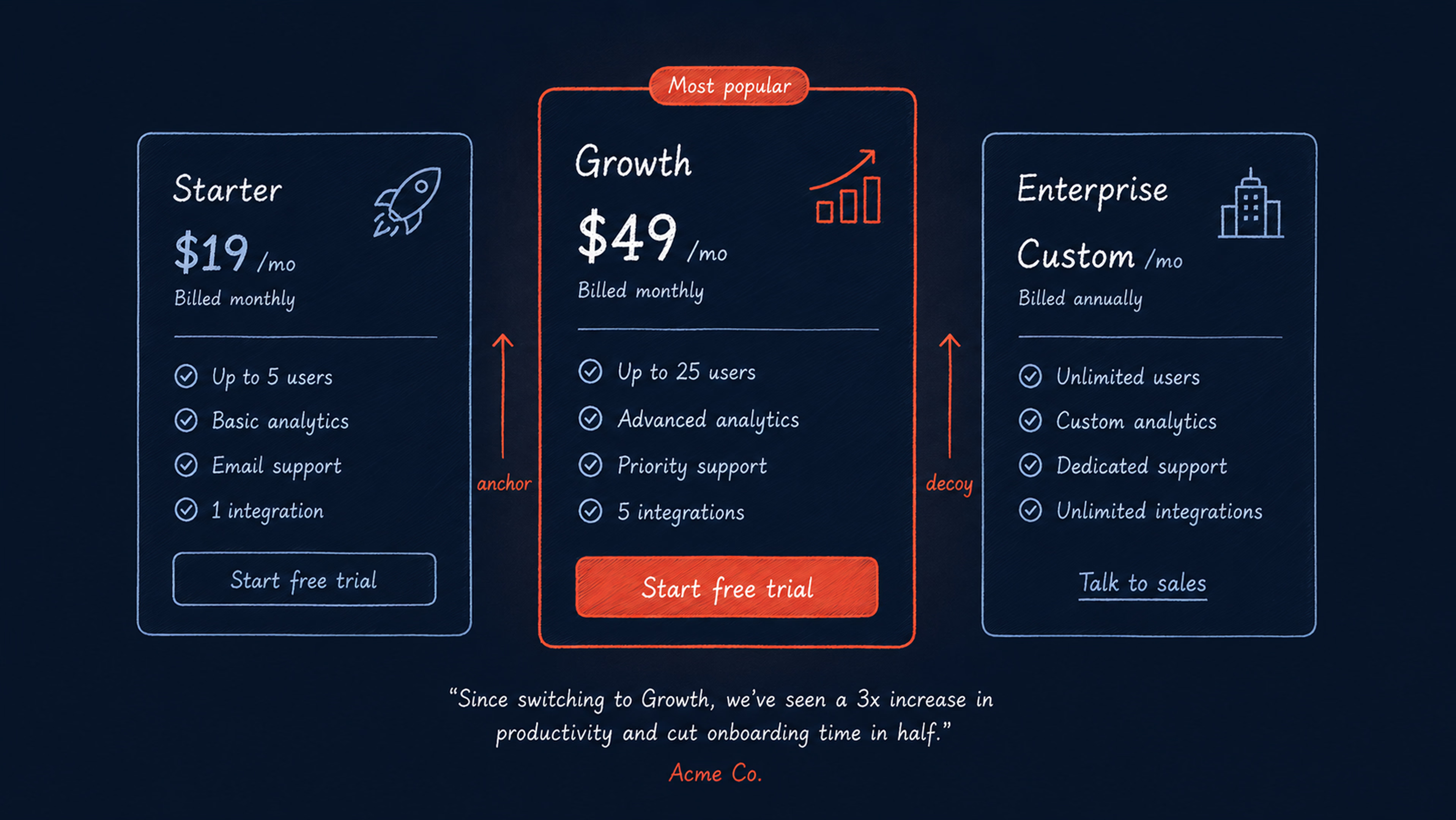
Anchoring shapes how buyers read the page. The first price they see becomes the reference point for every other plan, so tier order, default billing view, and highlighted options all influence how the offer is perceived.
Choice architecture also matters on pricing pages. Many SaaS products use three pricing tiers because this structure gives buyers enough flexibility without making the comparison feel overwhelming. Two options can feel limiting, while four or more often require more effort to evaluate.
At this stage, reassurance needs to sit close to the moment of doubt. A testimonial, short ROI proof point, security note, or customer logo placed near the pricing table can help resolve objections while the buyer is actively weighing the decision.
Feature framing can make the comparison easier, too. Instead of presenting every plan as a flat checklist, phrasing like “Everything in Starter, plus…” helps buyers understand what they gain as they move up a tier.
What an effective pricing page looks like
- 3 named tiers — by buyer segment (Starter / Growth / Enterprise), not Tier 1 / Tier 2 / Tier 3.
- Monthly/annual toggle — with savings percentage visible before the table.
- “Most popular” badge — on the middle tier, supported by visual treatment (border or background color), not just a text label.
- CTA per tier — “Try Starter,” “Start free trial,” “Talk to sales.” The enterprise CTA can work better as an outline button or text link if it represents a different buying motion.
- Friction reducers below the CTA — “No credit card required” or “Cancel anytime” can reduce hesitation for self-serve plans.
- Interactive pricing calculator — useful for usage-based models because it shows real-time cost as buyers input expected usage.
- Pricing FAQ below the table — 6–8 questions covering trial end behavior, plan changes, billing, security, and migration.
- One named testimonial focused on value — not a generic endorsement, but a specific ROI story.
Expert tip: Avoid hiding enterprise pricing entirely. “Contact us” without any starting range can create more abandonment than qualified leads. When exact pricing depends on scope, provide at least a floor, such as “Starting at $X/month for teams of 20+.”
Key metrics & KPIs
Tracking setup
What to trackHowPricing page viewedpricing_page_view — source_page, referrerPlan tier hoveredpricing_tier_hover — tier_id, duration_msCTA clicked by tierpricing_cta_click — tier_id, cta_textToggle usedpricing_toggle_click — from_period, to_periodCalculator interactionpricing_calculator_use — input_value, output_valueFAQ expandedpricing_faq_expand — question_id, applies to accordion FAQ only
Key metrics
MetricBenchmark / SignalPricing → trial/demo rate5–8% average, 15–20% top performersAnnual toggle rateLow = savings % not prominent enoughTier CTA distributionEnterprise dominating on self-serve = pricing misaligned with the audience
{{banner-2}}
Buttons & forms — signup form, demo request
Buttons and forms are where the page stops persuading and asks the visitor to act. A trial signup form with eight fields can lose users who were ready to start. A demo form that replies “we’ll be in touch in 48 hours” can lose buyers to competitors that let them book a meeting instantly. This layer decides whether the interest built across the page turns into action.
Buttons’ and forms’ roles from a UX perspective
The primary CTA should be easy to notice, reach, and understand. Fitts’s law makes size and placement important: the main action should be large enough to tap or click comfortably and positioned where users naturally expect to act. Visual hierarchy does the next part of the work. If the CTA blends into surrounding elements, users can miss it even when the copy is clear.
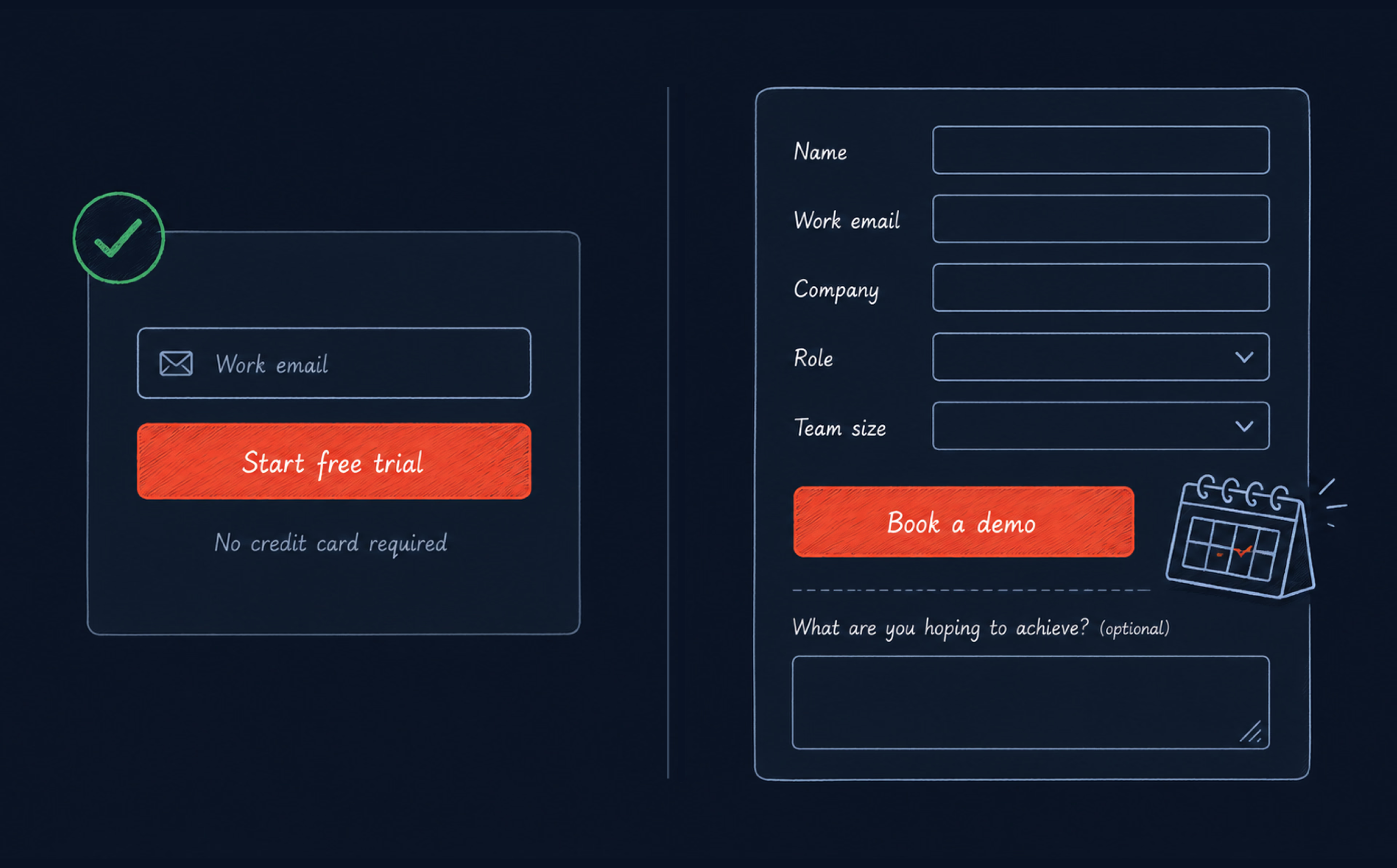
Form length shapes the decision, too. Every additional field asks the user to pause, think, and decide whether the request feels worth it. Instead of collecting everything up front, the form should ask only for the information needed to move the user to the next step.
Microcopy reduces hesitation when it makes the commitment feel clear and low-risk. “Start your free 14-day trial, no credit card required” works harder than “Sign up” because it tells users what happens next and removes a common objection before it appears.
What effective SaaS conversion elements look like
Strong SaaS forms are built around momentum. Each field, button, message, and confirmation screen should help users complete the action without adding doubt, delay, or unnecessary effort.
Trial signup forms:
- Email only for self-serve products. Name, company, and role can be collected during onboarding.
- Work email validator with an inline message. For example: “We’ll send your login details here.” This sets expectations and reduces confusion.
- Personal email blocking. If you block @gmail and @yahoo addresses, say so before the field, not after submission.
- Specific confirmation screen. Use “Check your inbox — your login link is on its way” instead of a generic “Thank you.”
The most effective forms are not the ones that collect the most information, but the ones that collect just enough to move the user forward without breaking momentum.
Demo request forms:
- Five fields maximum. Name, work email, company, role, and team size are usually enough for the first step.
- Phone number optional. Do not require it for an initial demo request unless the sales motion depends on a call-first process.
- Calendar embed. Add Calendly, Chili Piper, or a similar scheduling tool directly in the form or on the confirmation screen. Buyers who can book immediately are less likely to drop off while waiting for a follow-up email.
- One optional open field. “What are you hoping to achieve?” can help sales prepare, but it should be clearly marked as optional.
- Interactive demos. Ungated product tours built with tools like Navattic, Arcade, or Storylane can give buyers a lower-friction way to explore before committing to a full demo. If the site asks users to book a sales call before seeing the product, a “Take a 5-minute tour” CTA can keep more of them in the funnel.
Key metrics & KPIs
Tracking setup
What to trackHowCTA clickedcta_click — cta_id, page, position, cta_typeForm startedform_start — form_id, form_type (trial/demo)Form submittedform_submit — form_id, successForm errorform_error — field, error_typeCalendar bookedcalendar_booking_complete — source_page, time_to_bookInteractive tour startedproduct_tour_start — source_page
Key metrics
MetricBenchmark / SignalTrial signup completionEmail-only: 60–80%, multi-field: 30–50%Demo form completion30–50% for a 5-field form, below 20% = too many fieldsForm drop-off by fieldWhich field causes the most abandonment
Landing pages / campaign pages
For SaaS and services, campaign landing pages serve a fundamentally different purpose than the main website. While the homepage supports buyers at different stages of awareness, a landing page has one job: convert a specific visitor from a specific source on a specific offer.

Landing and campaign pages’ roles from a UX perspective
A campaign page starts with message match. The headline should echo the ad, email, or referral link that brought the visitor there, so they immediately feel they have landed in the right place. When the message changes too much between the source and the page, visitors have to reorient themselves, and that extra effort can increase bounce rates.
The rest of the page should protect that focus. A strong landing page is built around one conversion goal, with every section moving the visitor toward the same action. This is where Hick’s law becomes especially relevant: the more choices the page introduces, the more attention it pulls away from the intended CTA.
What an effective SaaS landing page looks like
- Hero with matched headline — directly echoes the source message and names the specific outcome for the specific audience.
- Social proof above the fold — one high-relevance client logo or testimonial before the benefits section.
- Benefits section — 3–5 outcomes, written around the user’s result, not the product’s capability.
- Product visual or demo video — screenshot, animated GIF, or a 60-second product walkthrough.
- CTA section — primary CTA repeated, with “no credit card required” in small text below the button where relevant.
- Objection handling — 3–4 FAQ-style answers to the most common hesitations for this specific audience.
Expert tip: Personalization on landing pages can improve engagement and conversion metrics when it supports the visitor’s context. Even a simple change, such as showing a testimonial that matches the referral source or industry, can make the page feel more relevant without requiring a fully personalized experience.
Key metrics & KPIs
Tracking setup
What to trackHowPage viewedlanding_page_view — campaign_id, source, variantCTA clickedlp_cta_click — cta_text, position, variantForm submittedlp_form_submit — form_id, successScroll depthTriggers at 25 / 50 / 75 / 100%
Key metrics
MetricBenchmark / SignalLanding page conversion rateSingle CTA: 13.5%, multiple CTAs: 10.5%. Below 5% = message match or offer problemBounce rateAbove 70% on paid traffic = headline or message mismatch
Contact / booking page
A visitor who reaches the booking page has already shown strong intent. They may have read your positioning, checked pricing, compared alternatives, or arrived from a referral, ready to talk. The only remaining question is whether your page makes that easy enough to complete.
Contact / booking page’s role from a UX perspective
The booking page should protect the intent the visitor already has. Once someone is ready to engage, every extra field, vague instruction, or delayed response creates a new reason to pause. The experience should feel direct, low-effort, and clearly connected to the action they came to take.
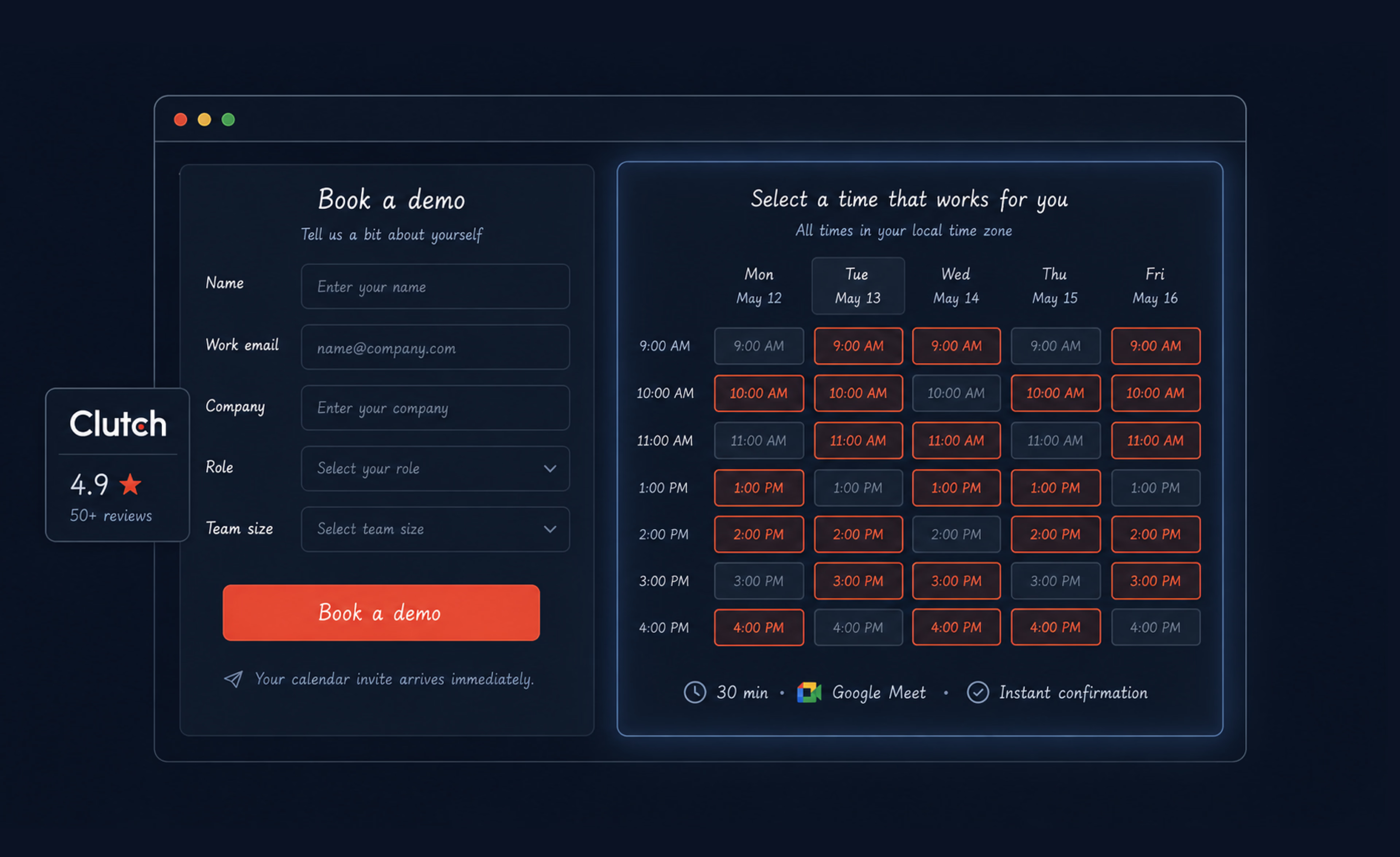
Trust still needs reinforcement at the point of action. A rating, client logos, or a short testimonial placed near the form can reduce last-minute hesitation because reassurance appears exactly where the visitor is making the decision.
Expectation setting is the final piece. Clear, immediate outcomes like “Pick a time that works — you’ll get a calendar invite instantly” tend to perform better than open-ended messages like “We’ll get back to you.” One creates a sense of momentum and control, while the other introduces uncertainty and waiting.
What an effective booking page looks like
Calendar embed (tools like Calendly, Chili Piper) often works well for demo booking on self-serve and mid-market products. It secures real availability, no email back-and-forth, and immediate calendar confirmation. You should also add 2–3 qualifier questions in the booking flow, so the sales rep arrives with context. Besides, a lead form is necessary for complex enterprise inquiries. Keep it to five or six fields where possible, since longer forms usually create more friction.
Always include:
- Specific response time commitment: “Your calendar invite arrives immediately” or “We reply within one business day.”
- Alternative contact: a direct email address or chat widget for visitors who prefer not to use the form.
- Social proof adjacent to the form: Clutch or G2 rating, client logos, or a one-line attributed testimonial.
Key metrics & KPIs
Tracking setup
Key metrics
Footer
The footer rarely drives conversion by itself, but it can support trust when buyers are doing due diligence. This is where they look for compliance details, legal policies, links to documentation, company information, and alternative contact methods. If those signals are missing or hard to find, the site feels less credible than the product may actually be.
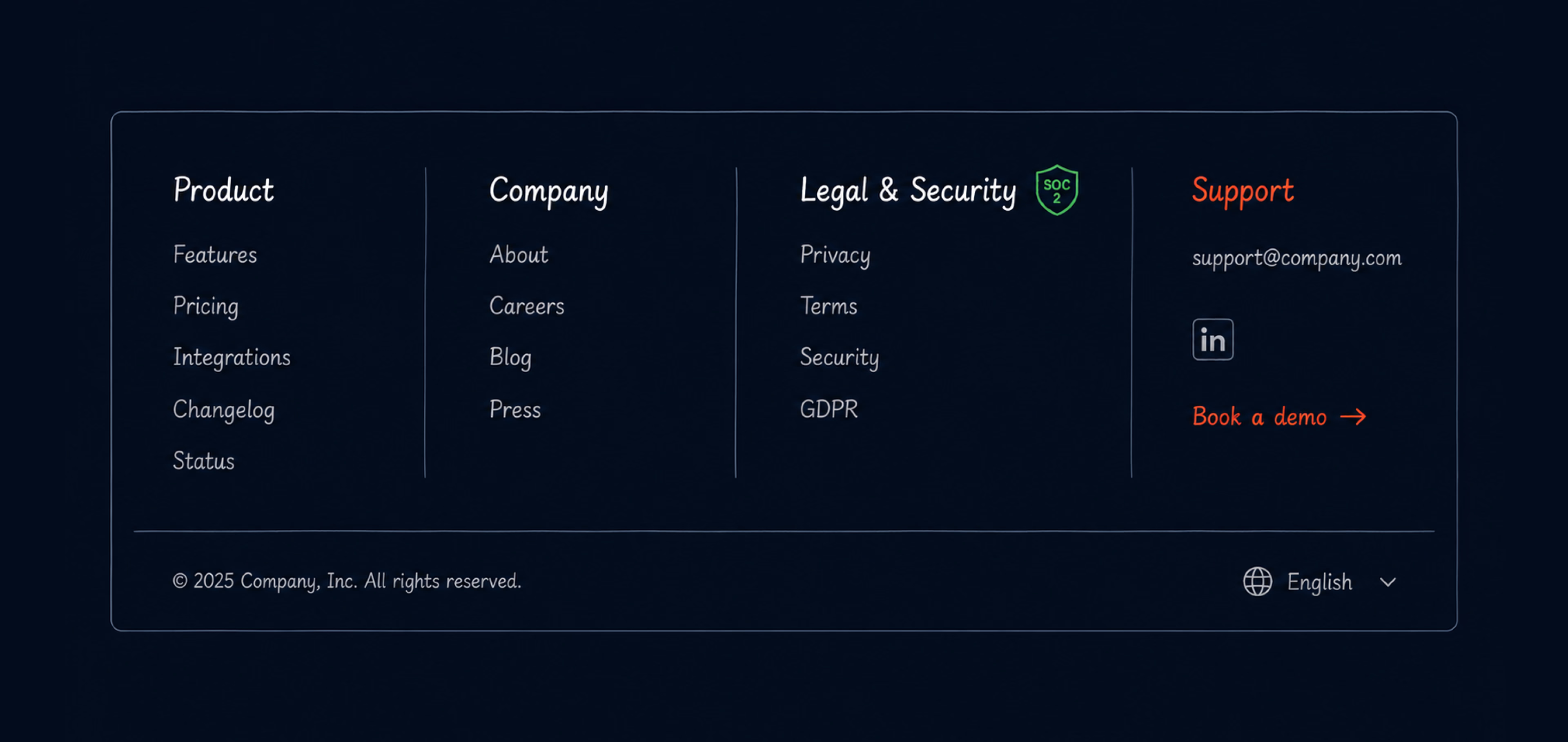
What a well-designed SaaS footer looks like
A strong SaaS footer usually includes four clear columns:
- Product: Feature pages, pricing, integrations, changelog, and status page (uptime/incidents — an often-missed but high-trust signal for enterprise buyers).
- Company: About, careers, blog, and press.
- Legal & Security: Privacy policy, terms of service, security overview, and GDPR, SOC 2, or HIPAA information where relevant. These are the compliance signals enterprise buyers often check before moving forward.
- Support & Contact: Documentation, support email or chat widget, LinkedIn, and a secondary “Book a demo” text CTA.
Expert tip: Logos in footers can support trust, but they are usually a passive signal. Social proof is more effective when placed near CTAs or on the pricing page, where hesitation is more likely to appear.
Key metrics & KPIs
Tracking setup
What to trackHowFooter viewedfooter_view — page_typeFooter link clickedfooter_click — link_text, link_categoryFooter CTA clickedfooter_cta_click — cta_text
Key metrics
MetricSignalFooter reach ratefooter_views / page_viewsTop footer linksReveals navigation gaps in the main navFooter CTA click ratefooter_cta_click / footer_views — shows whether visitors who reach the footer act on the secondary demo CTA
Conversion is a system, not a page
By this point, you should have a clearer map of where SaaS website conversions usually leak: the first message users see, the proof they need, the pricing details they compare, the forms they hesitate to complete, and the booking flow that either keeps momentum or breaks it. The next step is not to redesign everything at once. Start with the pages closest to revenue, track where users slow down, and compare the numbers with real behavior from heatmaps, recordings, and funnel reports.
Once every page has a clear role, every CTA has a clear purpose, and every form only asks for what it truly needs, conversion will no longer be guesswork. Then, it becomes a system your marketing team can measure and improve.
{{banner-3}}
FAQ
What’s a real visitor-to-lead benchmark for a SaaS website?
A realistic B2B SaaS visitor-to-lead benchmark is often around 1.5–2.5%, while stronger performers can reach 8–15%. If the rate stays below 1%, it may signal a problem with hero messaging, value proposition, traffic quality, or audience fit. If it sits around 1.5–3% but does not improve, check for friction on pricing, forms, CTAs, and demo request flows.
Should our hero CTA say “Start free trial” or “Book a demo”?
It depends on your sales motion. “Start free trial” works for self-serve products where users can experience value independently. “Book a demo” works for complex products or mid-market and enterprise buyers who expect a sales conversation.
What’s a good pricing page conversion rate?
A useful directional range for SaaS pricing pages is around 5–8%, while stronger performers can reach 15–20%.
How many fields should a demo request form have?
For an initial request, five to six fields are usually enough: name, work email, company, role, and team size. Phone number should stay optional unless your sales process genuinely requires a call-first approach. Every additional required field adds friction, so collect deeper context through the onboarding flow or sales call, not the first form.
How do I prioritize what to fix first?
By revenue impact times implementation effort. For most SaaS websites, pricing page conversion comes first (highest intent, most directly tied to pipeline), hero messaging second (affects all downstream conversions), demo form friction third, then homepage structure and landing pages.
What tools do I need to run this audit?
At minimum: Google Analytics 4 (funnel analysis, event tracking), Hotjar or Microsoft Clarity (session recordings and heatmaps on the pricing page and signup flow), and your CRM to track lead-to-SQL rates by source. For A/B testing: Optimizely or VWO. For the pricing page specifically, Heap or Amplitude lets you track tier hover and toggle interactions in granular detail.
How does this audit differ from an SEO audit?
An SEO audit focuses on how well your site attracts traffic — keyword rankings, crawlability, and technical health. A conversion audit focuses on what happens after visitors arrive — whether they take the actions that generate pipeline. Both matter, but if your traffic is already there and not converting, the conversion audit comes first. For a broader look at the types of digital audits, see our guide to what a digital audit is and why it matters.